

This chart is your real estate GPS—it tells you if your market is hot, cold, or balanced based on your home type and price range. Whether buying or selling, use this data to set realistic expectations and make smart decisions.
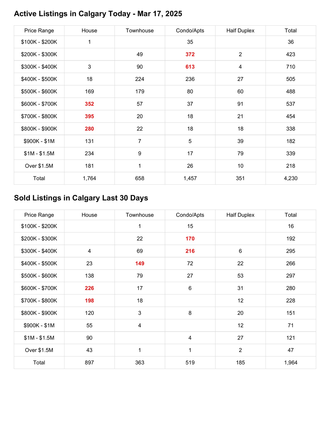
Buyer Example: House in the $700K - $800K Range
A buyer is pre-approved for $750,000 and is looking for a detached home in Calgary. The chart shows:
343 active house listings in this price range.
188 houses sold in the last 30 days.
This means supply is greater than demand, but homes are still selling at a steady pace. This is a balanced market—buyers have choices, but good homes will still attract multiple offers.
✅ Buying Strategy:
Since there are 343 active homes, the buyer has options and can negotiate.
They should look for listings that have been on the market longer, as sellers may be more flexible.
However, since 188 homes sold last month, desirable properties can still move fast—so having pre-approval ready is an advantage.
Seller Example: Condo in the $200K - $300K Range
A condo owner is planning to sell their unit in the $200K - $300K range. The chart shows:
316 active condo listings.
168 condos sold in the last 30 days.
This suggests a buyer’s market, where supply exceeds demand. Sellers in this range need to be strategic to attract offers.
✅ Selling Strategy:
With many competing condos, pricing must be competitive—listing too high may lead to a longer time on the market.
High-quality photos, staging, and marketing will help the condo stand out.
Offering buyer incentives, such as covering closing costs or including appliances, could attract more interest.
Final Thought:
Instead of asking, “How’s the market?”, the real question is, “How’s the market for the home type and price range I’m interested in as a seller or a buyer?”.
With the right question, both buyers and sellers can use this data to their advantage.
Comments:
Post Your Comment: